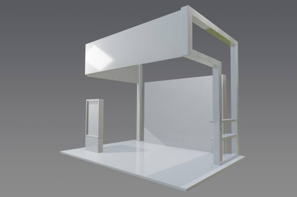
Trade shows are a cornerstone of many B2B marketing plans because they let companies meet clients face-to-face, gather quality leads, and build brand buzz. While massive exhibits wow onlookers with sheer size, the 10×10 booth rental is still the go-to choice for firms that want a strong presence without blowing the budget. Getting the most from that small footprint takes careful thought, and nowhere is that more true than in the booth’s design.
Unfortunately, even seasoned exhibitors fall into easy-to-spot design traps that sap the energy of their set-up, turning a promising event into a missed chance to connect. Whether your team is debuting on the show floor or simply testing a fresh look, this guide walks through the biggest design blunders to dodge-and why tactics borrowed from larger 10 x 20 spaces work just as well in tighter confines.
Overcrowding the Booth with Visual Clutter
One problem many 10 x 10 booths share is the urge to cram in every idea, product, and logo on the list. Because the area feels so small, exhibitors fight the panic of being ignored and end up stacking busy graphics, dense text, tons of samples, and even oversized chairs in one corner. The result is a space that greets passers-by with noise instead of welcome and quickly leaves everyone feeling rushed, confused, and ready to move on.
Poor Messaging Discipline
Many companies show up with too much info and drown their visitors. When space is tight, clarity wins.
How to avoid it:
Limit your key messages to one main headline and two supporting points.
Use high-impact visuals rather than blocks of text.
Feature only your most relevant product or service.
Keep furnishings minimal and multi-functional.
A 10×20 booth gives miles of breathing room. A 10×10 wont, so every surface must work hard for you.
Ignoring Vertical Space and Signage Opportunities
Exhibitors shrink to the floor and miss the ceiling. In a compact setting, going up multiplies visibility without crowding the aisles.
What you can do instead:
Install a tall back wall with clean branding and lighting accents.
Use shelving or vertical product displays to conserve space.
Add hanging signage or banners if allowed by show regulations.
If you borrow a little from the 10 x 20 booth design method, you can break your visuals into layers—putting logos, taglines, and big images at different heights for people to see up close or from farther away. This stacked look not only makes the space pop but also guides the eye so the whole area feels easier to scan.
Poor Layout and Traffic Flow
One mistake new exhibitors make is blocking visitor movement with the setup. Picture a table jammed right at the entrance or staff turned away from the aisle; suddenly the booth feels closed and no one wants to step in.
Key layout problems to dodge:
- Barrier tables up front that keep people out.
- Tight aisles or dead corners that trap guests.
- Stands that force team members to ignore passersby.
To get traffic moving:
- Keep the middle of the booth clear so visitors can walk in.
- Set brochures, tablets, and giveaways on the side walls.
- Plan positions that let staff make eye contact and talk right away.
Even a 10 x 10 trade show booth rental can feel roomy if you focus on openness and give the team smart spots to stand and greet everyone.
Inconsistent Branding or Visual Identity
Every piece of your booth should look and feel like you, even in a tiny 10 x 10 space. Sadly, lots of companies treat that mini footprint as a throwaway, tossing on mismatched banners and graphics pulled from last year’s presentation. Guests get the wrong idea, and the business name sticks less firmly in their heads.
Common branding errors:
- Mixing old logos with fresh colors or using palettes borrowed from unrelated campaigns.
- Hanging photos that are blurry, pixelated, or the wrong size for the display area.
- Allowing completely different wording or tone to appear on posters, handouts and giveaways
Best practices:
- Lock in your core brand colours, typefaces, and key images before any printing.
- Always choose high-resolution printing for banners, table covers and backdrop panels.
- Plan a single design that can shrink from a 20-foot wall to a 10-foot corner without losing impact.
Even a larger booth often divides into mini zones showing different product stories. You can create that same feel in a small footprint simply by making every visible piece match, speak kindly, and shout your brand’s name.
Neglecting Pre-Show Planning and Post-Show Utility
Most headaches don’t show up the first day on the floor; they sneak in long before. Many exhibitors skip over the rule book, ignore power needs, or wait until the night before to pack their kit. Others toss out perfectly good displays because nobody considered how they’d look in the office after the event.
Pre-Show and Post-Show Mistakes
Before the event even starts, designers often trip over a few small details. The biggest offenders are not checking the venue’s rules about how high displays can go or where lights can hang. Forgetting to ask where power plugs will come from-or what audio-visual gear might be crammed under the table-can ruin a solid look. Never skip a mock-up or digital 3D view; seeing a booth on screen saves headaches.
After the last visitor leaves, lots of companies discover their investment is nearly useless because the design was one-and-done. If a booth isn’t built to be taken apart easily or to swap out parts, it gathers dust in the warehouse. Equally painful are heavy banners or oversized shelves that cost a fortune to send to the next show.
Partnering with a seasoned team, especially one that regularly handles 10×20 booth design, brings handy scalable know-how. They guarantee that a simple 10×10 trade show booth rental becomes a reusable tool slipped into a wider show plan.
Conclusion: Small Space, Smart Strategy
Few marketers will argue that a sleek 10×10 trade show booth rental can pay for itself-still, it never happens by accident. Instead of cramming in more gimmicks, the goal is smarter choices that amplify your message. By dodging the common blunders listed already, your space will shine in a crowded aisle, help staff connect quickly, and imprint your brand on minds long after the final scan.
Key Takeaways
- Keep your layout clean and focused.
- Maximize vertical and visual space.
- Prioritize brand consistency and clarity.
- Avoid common planning mistakes by thinking ahead.
- Treat your 10×10 booth plan with the same care you give a 10 x 20 layout.
Good strategy and clean design can turn a tiny space into a showstopper. Whether you’re rolling out a new product, testing a fresh market, or catching up with old partners, your setup should project confidence and never look half-built.